

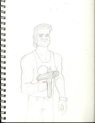
I actually liked the simple drawing quite a bit, mostly just because of the movie. But obviously it was missing something. So, I decided to ink it, and add my favorite line in the movie to fill in some empty space, because as we all know I'm absolutely awful at creating background imagery. I used a Faber Castel brush pen and assorted thicknesses of Micron pens to do this. I scanned it, dumped it into photoshop, and adjusted the levels (Enhance>Adjust Lighting>Levels, on Photoshop Elements) to wash out color and pencil marks that were picked up during the can. It then looked like this

I went for the old school font that is used in the original poster to add some extra flavor. I ended up not really getting the writing to look that much like the original, but using the same colors really made it obvious. Colors on Jack himself were pretty easy, as I decided to go for some cell-shading instead of gradients like I had just taught myself on my previous cowboy project. I had tried to use gradients, but it just wasn't looking the way I wanted, and I think cell-shading was really the right call. Simple flat colors with a light and light and dark shade for each. For the actual background I just went with a gradient as I didn't feel like spending the time to draw one out(I did this entire thing, sketch to finish, in one night in a few hours). I added a circular yellow>blue gradient, and decided to add some quick yellow highlights to the sides of Jack to give the gradient a subtle lighting effect. Finally, I dropped an old paper texture over it(same one I used for the sensei illustration). All in all, it was a simple drawing but I love the movie, and it reminds me of it a lot, so I'm pretty happy with it.
-Pete
No comments:
Post a Comment